

3 Reasons to Use Responsive Design for Email and Landing Pages
What is Responsive Design and why should marketers care?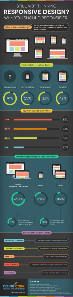
Marketers who care about better campaign results are rapidly turning to responsive design for email and landing pages. “Responsive Design” is yet another bit of marketing tech jargon (we in the tech business really like to confuse people with our terminology) that has exploded upon the world. In it’s simplest definition, responsive design is the practice of using a particular set of technologies that enables content to be viewed in an optimal way on devices with screens of varying sizes. As the world has rapidly shifted it’s content consumption habits to include mobile devices and tablets, marketers and the technologists that support them have scrambled to develop a common way of delivering that content in a mobile friendly way, without having to maintain multiple sets of software code. Thus, the birth of responsive design. Our friends at Flying Cork Media recently published a great infographic with compelling stats & graphs that helps describe why businesses ought to be focused on responsive design. While many marketers are focused on re-developing their primary web sites to take advantage of responsive design, it is just as important to use responsive design for email and landing pages, as these are the front end of much of your user interaction.
Why use Responsive Design for Email and Landing Pages?
1.) Achieve better email and landing page results
By giving customers the content they want in a way that they can view, click and take action without having to scroll around or spend time zooming in and out, marketers are finding they are getting better metrics from their campaigns. A recent survey by Experian discovered that 50% of unique email opens are now happening on mobile devices. As you can imagine, mobile centric customers have short attention spans and little patience for emails and landing pages that make them work. Good responsive design presents the most important content first, and offers a simple way to navigate to “below the fold” content without resorting to complicated actions. As a results, brands like Allrecipies.com are seeing big jumps in opens and clicks after implementing responsive design into newsletters, and B2B companies like Voices.com are seeing landing page conversion rates increasing by up to 140% after implementing responsive web design.
2.) Build email and landing page templates more quickly for higher ROI
In addition to better campaign performance, marketers are finding that responsive design can speed up the process of developing templates, as better structured templates and HTML cut down on the time it takes to build and QA each email campaign. While creating responsive email and landing page templates takes time and energy, the process is an investment that yields results for a long time. After the initial design in complete, the process of modifying templates in subsequent campaigns is streamlined, resulting in lower overall campaign costs and higher ROI. The design, building and testing processes are all faster, as a single set of more highly structured HTML code is being developed for rendering in email clients or browsers.
3.) Responsive design is recommended by Google
All marketers pay attention to what Google says, as it dominates search and display advertising, and also commands over 80% of the world wide smartphone market with it’s Android OS. When it comes to responsive design, Google is quite clear – get on board. The following is a quote from from Google’s Developer Webmaster support site:
We recommend using responsive web design because it has many good aspects:
- Using a single URL for a piece of content makes it easier for your users to interact with, share, and link to your content, and a single URL for the content helps Google’s algorithms assign the indexing properties for the content.
- No redirection is needed for users to get to the device-optimized view, which reduces loading time. Also, user agent-based redirection is error-prone and can degrade your site’s user experience (see “Pitfalls when detecting user agents” section for details).
- It saves resources for both your site and Google’s crawlers. For responsive web design pages, any Googlebot user agents needs to crawl your pages once, as opposed to crawling multiple times with different user agents, to retrieve your content. This improvement in crawling efficiency can indirectly help Google index more of the site’s contents and keep it appropriately fresh.
Stripping out the techie talk, Google is telling us to use responsive design because it makes your users lives easier (particularly for sharing your content) as well as Google’s life easier. Whenever marketers make Google’s life easier, their content tends to be prioritized or difficult to manage content.
Lightweight marketing automation makes responsive design easy
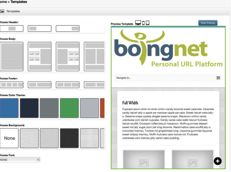
While the thought of reworking email and landing page templates to take advantage of all of the positive attributes of responsive design can seem daunting, it doesn’t have to be a massive development project. Today’s marketing automation solutions can make the technical part of the process largely a point and click exercise. In Boingnet v2, the Template Builder (see below) has a simple interface where the header, body and footer and selected, you fill in the blanks with your text, images, video or other content, and you are off to the races. If you are interested in learning more or have questions about responsive design, we’d love to hear from you. Give us a shout at (800) 264-6420 or shoot us a note at our Contact Page and we’ll dig in on any questions, ideas or thoughts you might have.
If you enjoyed this, please share it with your network!
Written by
Dennis Kelly is the CEO of Boingnet. A serial entrepreneur, he's a marketing fanatic and obsessed with building a great company to fulfill Boingnet's vision.
