

What the Newest Google Update Means for Landing Pages and Microsites
What Google Update?
Google announced that it would be restructuring its search engine algorithm in order to favor mobile-friendly web pages on April 21st. This means that today the highest ranked web pages on Google are formatted to optimize their visitors’ mobile experience. The term “mobile-friendly” means that a given web page is coded to automatically optimize its formatting to any screen size. The text is in a legible font size, pictures stay formatted so that the viewer will be able to read the content equally as easily on any screen size. So, what does this mean for your web pages and online properties? It means that all of the hard work you’ve put into SEO over the past several years will be useless if your pages aren’t mobile-friendly. To learn about the specifics of the Google update in more depth, click here.

Many businesses have invested in mobile-friendly templates for their primary brand websites, and Google’s update will force others to make the move soon. But marketers can’t stop at the website. Today’s conversion driven marketing teams are building landing pages and microsites for every campaign they launch. The pages used by these campaigns need to be just as mobile-friendly as the company’s website, or results will begin to plummet, quickly. Nobody wants Google steering visitors away from their campaign landing pages and microsites.
Why Mobile-Friendly?
Take a moment and think about how many times you looked at your mobile device today. Now think about how many emails you opened on it and how many times you used it to access the Internet. Finally, think about how annoying it was to open a page 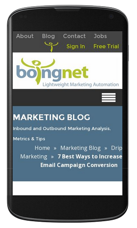 that wasn’t optimized to your small screen – all the zooming and scrolling was a waste of your precious time.
Google is thinking the exact same thing. They recognize that the modern consumer is always using his or her phone. In fact, 55% of email opens in 2014 occurred on mobile devices or tablets. The implications are huge. Companies whose websites, landing pages and microsites are not 100% mobile-friendly are actively losing engagement with massive percentages of the consumer base. Even if Google was not undergoing this update, there is still a major case to be made for going mobile-friendly.
Test Your Website, Landing Pages and Microsites:
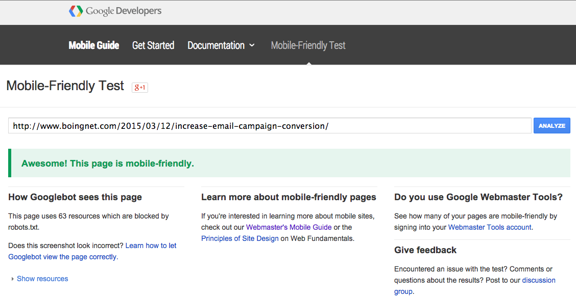
Google has developed a free testing tool for anyone to check and see if their sites and pages fall within Google’s definition of mobile-friendly. You can test out any page that you like – in Google’s new definition, you are either mobile-friendly or you are not. There are no shades of gray: click here to test your webpage.
What’s the Solution?
The solution is surprisingly simple. It’s a concept known as responsive design, and it is proven to make your landing pages and microsites mobile-friendly. Responsive design is a new way of building HTML that automatically reformats the text, images and other content of a given web page to fit the screen on which it is being viewed. Some marketing automation platforms provide email, landing page, and microsite templates with responsive design already incorporated into the code. These services make the move to mobile-friendly campaigns effortless.
Sample Campaign with Responsive Design:
Imagine that your company decides to run a content marketing campaign to inform consumers about the eco-friendliness of one of your product lines. You set up an email campaign with a link to a microsite offering consumers an entry in a contest to help design the next green product if they fill out the form designed to augment your CRM database with new information. If you do this without using a responsive design template, your campaign will run as the past ones have: some click-throughs and landing page views all accessed through the email by desktop users. The consumers that opened your email with a mobile device will find it to be poorly formatted for their screens and difficult to read, so they will not pursue it further. In 3 months, the microsite will be dead for all intensive purposes, and a new campaign will launch.
Now let us suppose that you create the microsite from 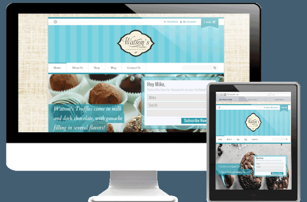 a template that uses responsive design. Every consumer opening your email on a mobile device will find that it is attractively formatted and that the microsite and landing pages are optimized for their small screens. Additionally, since Google now recognizes your microsite as mobile-friendly, it will have a significantly better search engine presence and will attract more consumers from Google searches. Suddenly, by using the latest tools, you have doubled your response rate. Responsive design really works, and it is becoming even more valuable after the announced Google update.
Boingnet’s Role:
If you are looking for an inexpensive and effective way to implement responsive design in your campaigns, look no farther than Boingnet. Boingnet is a lightweight marketing automation software provider that includes responsive design in every email, landing page, and microsite template. Our product is designed to help agencies and small businesses succeed, and our pricing models reflect that. With Boingnet, your landing pages and microsites will thrive like never before under the newest Google update.
Written by
Simon Merryweather has worked in a variety of marketing and market research capacities for Boingnet. A passionate student and content creator with particular interests in data driven and content marketing principals, he can also be found on ski slopes of New England or fly fishing in the waters of the South Shore of Massachusetts.
